How To Create Custom Forms For Cireson Portal

This article applies to: Cireson Portal, version 2.x and above.

Starting in version 2, the Cireson Portal has enables administrators to define how they want forms to be displayed.  This functionality means that you have full control over how & where fields are laid out on a form, the UI that is used for each input, and you can even arrange your field inputs into a tab grouping.  You can define your forms using the JavaScript Object Notation (JSON).  You can create custom forms for incidents, service requests, change requests, problems, release records, and asset management by adding a respectively named JavaScript file to the C:\inetpub\CiresonPortal\CustomSpace directory.  For example:

  • Incident,js​​
  • ServiceRequest.js
  • ChangeRequest.js​

Important note:  Cireson Portal v3 adds additional form definition files for asset management and problem and release record related forms  which can also be used to create custom forms.

Important note:  Cireson does not support creating custom forms for or using classes that derive from out of the box classes.

A single custom form file can contain multiple definitions for multiple custom forms of the sametype.  Custom forms can then be mapped to AD Groups via the admin settings in portal so that you can define different custom forms for different AD Groups. The easiest approach to get started is to copy the JSON text from the out of the box file into the corresponding \CustomSpace file.  For example, copy all of the contents of the file at C:\inetpub\CiresonPortal\Scripts\Forms\Templates\Incident.js into a newly created text file at C:\inetpub\CiresonPortal\CustomSpace\Incident.js.  Then you can start modifying the out of the box forms to override the layout and behavior of the forms provided out of the box.  You can also add additional custom forms. Out of the box, two forms are provided:

  • Default – shown to analysts
  • DefaultEndUser – shown to end users

If you create forms with the same name in the \CustomSpace, they will override the forms that are shipped out of the box in the \Scripts\Forms\Templates\ directory. You can target forms at AD groups so that users that are in those groups see a specific custom form.  In this way you can display some custom properties to some users and not others.  This is also useful for showing some users forms that have some fields enabled and other users see a form with the fields disabled. You can target forms at AD groups in the portal admin settings page after you log in as a SCSM administrator.  To do this log in as a Service Manager administrator to the portal.  In the upper right corner mouse over your name and select Admin Settings.  At the bottom of the page there is a table where you can add/configure form mappings.  To add a mapping, click the Add button to add a row to the table and fill it out as follows:

  • AD Group with Access: Enter the username of the group that you want to target the form at.
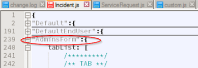
  • Form ID: Enter the ID of the form from the .js file. E.g in the below example the Form ID is AdminsForm
Unknown
  • Ordinal: This controls the order in which the forms are applied.  This is useful when you have users that can be in more than one group that has a form targeted at it.  In that situation, the form with the lowest ordinal will be applied.
  • Form Type: Choose Incident, Change Request, or Service Request
  • Form Projection ID: Every form is bound to a type projection.  Enter the GUIID of the type projection here.  This is for advanced users that have created custom type projections that include custom relationship types in them.  If you don’t know the ID of the type projection to use, you can use the GUID of the type projections that Cireson provides out of the box as follows: 
        • Change request: 4c8f4f06-4c8f-a1b6-c104-89cfb7b593fa
        • Service request: 7ffc8bb7-2c2c-0bd9-bd37-2b463a0f1af7
        • Incident: 2d460edd-d5db-bc8c-5be7-45b050cba652
        • Problem: 45c1c404-f3fe-1050-dcef-530e1c2533e1
        • Release record: 556e527e-893c-61fa-5663-49d9944fccbd

A form definition can be built using:

  • ​Tabs
        • tabList (array of objects) and array of tab object​
            • name (string) the string label for the table
            • content (array) array of field groups
  • Field Groups
        • customFieldGroupList (array) array of field​​ groups
            • ​​​name (string)​ string label used as the header for the section
            • rows (array) array of column field arrays
  • Columns of Fields
        • columnFieldLIst (array) an array of field objects
  • Field (object)
        • DataType (string) the field type that will be used in the UI
        • PropertyDisplayName (string) the label that will be used for the DataType in the UI
        • PropertyName (sting) the value for the Property/Relationship data to bind to the UI
        • ColSpan (int) the number of columns the DataType will span in relation to the other DataTypes in a row, defaults to 1
        • Required (Boolean) set if a value is Required to be set for the Property/Relationship on form save, defaults to false
        • Disabled (Boolean) set if DataType should be disable from user input (Propery/Relationship can still be modified view the View Model), defaults to false
        • ​DataType Options [additional config settings]:
            • Boolean
              • Inline (Boolean) display label inline with checkbox
            • ​Button
              • ButtonType (string) predefined button style, options: default, primary, success, info, warning, danger, link
              • Action (string) the name of a function in the VIewModel to bind the button click to.  You can add custom functions via the custom.js custom tasks feature.  See below for example.
            • ​Date
              • FromFilter (date) js date object for min date value
              • ToFilter (date) ​​ js date object for max date value
              • FromRelative (string) a human readable string for setting min date value; example: “days:-5” or “days:+5”
              • ToRelative (string)  a human readable string for setting max date value; example: “days:-5” or “days:+5” ​
            • ​DateTime
              • FromFilter (date) js date object for min date value
              • ToFilter (date) ​​ js date object for max date value
              • FromRelative (string) a human readable string for setting min date value; example: “days:-5” or “days:+5”
              • ToRelative (string)  a human readable string for setting max date value; example: “days:-5” or “days:+5” ​
            • Decimal
              • DecimalPlaces (int) number of allowed decimal places, defaults to 20 
              • MinValue (int) ​​ minimal allowed value
              • MaxValue (int) maximum allowed value
              • StepIncrement (int)  ​defaults to 1
            • ​Display
              • HideLabel (boolean) hide field label from being displayed, defaults to false
            • ​Double
              • DecimalPlaces (int) number of allowed decimal places, defaults to 19 
              • MinValue (int) ​​ minimal allowed value
              • MaxValue (int) maximum allowed value
              • StepIncrement (int)  ​defaults to 1
            • ​Editor –display and HTML editor control
            • ​Enum
            • Int32
              • DecimalPlaces (int) number of allowed decimal places, defaults to 0
              • MinValue (int) ​​ minimal allowed value, defaults to -2147483648
              • MaxValue (int) maximum allowed value, defaults to 2147483648
              • StepIncrement (int)  ​defaults to 1
            • LongString
              • Rows (int) the number of rows the text area will take up (height)
              • MinLength (int) the minimum string length
              • MaxLength (int) the maximum string length
            • ​Numeric
              • DecimalPlaces (int) number of allowed decimal places, defaults to 2
              • MinValue (int) ​​ minimal allowed value, default 0
              • MaxValue (int) maximum allowed value, 100
              • StepIncrement (int)  ​defaults to 1
            • ​ObjectPIcker
              • ExtraProps  Put the names of properties of the related object here separated by commas.  When the form is rendered the property values will be displayed below the textbox when an object is selected.
              • ClassId (Boolean) defaults false
            • ​Spacer
            • ​String
              • MinLength (int) the minimum string length
              • MaxLength (int) the maximum string length
            • ​UserPicker
              • ​ExtraProps  Put the names of properties of the related user here separated by commas.  When the form is rendered the property values will be displayed below the textbox when an object is selected.
              • MaxNumberOfResults (int) the maximum number of results to be returned in the auto-complete list, default 10.
              • FilterByAnalyst (Boolean) Whether or not to filter the suggested users to only those users that are a member of the analysts group.

These are used to display groups of fields with a predefined layout for certain types of data such as action log, activities, affected configuration items, etc.

      • name (string) the label string for the section heading of this predefined group
      • type (string) the predefined field index
      • Disabled (Boolean) set if the predefined field type should be disabled
      • Type Options
        • actionLog
        • activities
        • affectedItems
        • childWorkItems
        • fileAttachments
        • fileAttachmentUpload – sets the attachment section in a drag and drop format
      • userInput
Examples
Adding a Custom Button to the form

First add the custom function you want to execute to the custom.js file: app.custom.formTasks.add(‘Incident’, null, function(formObj, viewModel){   viewModel.set(“Demo”, function() {       alert(“hi”); }); }); Then add this to the custom form definition: { DataType: “Button”, PropertyDisplayName: “Click Me!”, ButtonType: “info”, Action:”Demo”}

Changing the Style of the ExtraProps Label
Unknown 1

Use this CSS override in the custom.css file to change the ExtraProps label style.

.help-block { color:red; font-weight:bold;}


For additional assistance, please visit the Cireson Community or contact team@cireson.com.